Typography

Our typography is both easily legible and deeply considered, leading with a grotesque font family crafted with history and deep design sensibilities.

Download all fonts

Typography

Our typography is both easily legible and deeply considered, leading with a grotesque font family crafted with history and deep design sensibilities.

Download all fonts

Typography

Our typography is both easily legible and deeply considered, leading with a grotesque font family crafted with history and deep design sensibilities.

Download all fonts

Primary brand typeface

Our primary typeface was created by Vercel in collaboration with Basement Studio and designer Andrés Briganti.

It is a clean, strong typeface that’s got nuance and personality when set in large headlines, but also easily legible at small sizes.

Primary brand typeface

Our primary typeface was created by Vercel in collaboration with Basement Studio and designer Andrés Briganti.

It is a clean, strong typeface that’s got nuance and personality when set in large headlines, but also easily legible at small sizes.

Geist

ABCDEFGHIJKLMNOPQRSTUVWXYZ abcdefghijklmnopqrstuvwxyz
0123456789
!@#$%^&*()?+

Display
Typography that leads with clarity
64.00px
4.000rem
Heading 1
A confident voice at every scale
40.00px
2.500rem
Heading 2
Built for complex information
32.00px
2.000rem
Heading 3
Readable from headlines to labels
24.00px
1.500rem
Body
Our type system keeps every message clear, consistent, and easy to navigate across applications.
18.00px
1.125rem
Caption
Guidelines · Updated July 2026
12.00px
0.750rem

Adjust the base size and ratio to explore the scale, then copy the resulting CSS custom properties.

Heading 1

64px · 500 · 90%

Real-world rail expertise

Heading 2

40px · 500 · 100%

Smarter thinking. Safer outcomes.

Heading 3

32px · 500 · 110%

Specialists who simplify complexity

Heading 4

20px · 500 · 110%

Partnership over process

Body

16px · 400 · 130%

We bring clarity and consistency to every stage of rail delivery.

12R · CAPTION

12px · 400 · 130%

Brand guidelines · August 2026

Secondary brand typeface

Our secondary typeface was created by Vercel in collaboration with Basement Studio and designer Andrés Briganti.

It adds a refined editorial touch that contrasts nicely with the clean pairings, bringing just enough sophistication and balance to our type palette.

Secondary brand typeface

Our secondary typeface was created by Vercel in collaboration with Basement Studio and designer Andrés Briganti.

It adds a refined editorial touch that contrasts nicely with the clean pairings, bringing just enough sophistication and balance to our type palette.

Geist Mono

ABCDEFGHIJKLMNOPQRSTUVWXYZ
abcdefghijklmnopqrstuvwxyz
0123456789
!@#$%^&*()?+

Heading 3 - Secondary

32px · 400 · MONO

Experience that moves projects forward

Heading 4 - Secondary

24px · 400 · MONO

Built for real rail environments

Heading 5 - Secondary

20px · 500 · MONO

Smarter thinking, safer outcomes

Heading 6 - secondary

16px · 500 · MONO

Collaborative by default

Using our typefaces

We don’t have a lot of guidelines around how to use our type. The main rules are to lean into Geist as your primary typeface in all execution.

It is also to ensure that the type treatments on any layout are clean and consistent.

Using our typefaces

We don’t have a lot of guidelines around how to use our type. The main rules are to lean into Geist as your primary typeface in all execution.

It is also to ensure that the type treatments on any layout are clean and consistent.

Balance headlines against our wordmark

When setting type, always ensure our Rail Solutions wordmark is either a touch smaller or a touch larger than your main headline size. We never want these elements to compete for attention, so make sure the most important element is largest, and everything else takes up less visual attention.

business card design usage demonstration

Balance headlines against our wordmark

When setting type, always ensure our Rail Solutions wordmark is either a touch smaller or a touch larger than your main headline size. We never want these elements to compete for attention, so make sure the most important element is largest, and everything else takes up less visual attention.

business card design usage demonstration

Balance headlines against our wordmark

When setting type, always ensure our Rail Solutions wordmark is either a touch smaller or a touch larger than your main headline size. We never want these elements to compete for attention, so make sure the most important element is largest, and everything else takes up less visual attention.

business card design usage demonstration

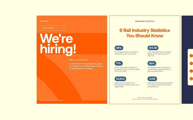
Use the grid

Always ensure it’s aligned to your document’s grid. That doesn’t mean that type needs to all be neatly left-aligned, but it does mean you should place type with consideration and consistency—using your underlying document grid as a guide.

instagram carousel containing social posts

Use the grid

Always ensure it’s aligned to your document’s grid. That doesn’t mean that type needs to all be neatly left-aligned, but it does mean you should place type with consideration and consistency—using your underlying document grid as a guide.

instagram carousel containing social posts

Use the grid

Always ensure it’s aligned to your document’s grid. That doesn’t mean that type needs to all be neatly left-aligned, but it does mean you should place type with consideration and consistency—using your underlying document grid as a guide.

instagram carousel containing social posts

Support

Need help with the guide?

We'll get back to you within 24h.

Support

Need help with the guide?

We'll get back to you within 24h.

Create a free website with Framer, the website builder loved by startups, designers and agencies.