Colors

The Rail Solutions color palette is much like our expertiseat first glance, its streamlined and simple. But theres a lot of depth underneath.

Download swatches

Colors

The Rail Solutions color palette is much like our expertiseat first glance, its streamlined and simple. But theres a lot of depth underneath.

Download swatches

Colors

The Rail Solutions color palette is much like our expertiseat first glance, its streamlined and simple. But theres a lot of depth underneath.

Download swatches

Primary brand colors

Our core color palette includes three primary tones: Orange, Coal, and Beige. These colors should be the first ones you reach for in any execution.

Primary brand colors

Our core color palette includes three primary tones: Orange, Coal, and Beige. These colors should be the first ones you reach for in any execution.

Safety Orange

HEX:

RGB:

CYMK:

#FD5000

253, 80, 0

0, 68, 100, 1

75%

50%

25%

Coal

HEX:

RGB:

CYMK:

#232942

35, 41, 66

0, 68, 100, 1

75%

50%

25%

Beige

HEX:

RGB:

CYMK:

#FEFEDE

254, 254, 222

57, 27, 0, 55

75%

50%

25%

Brand tones

Our oranges come in light, bright, and deeper tones, and can be used in support of—or in place of—our core colors in any and all brand executions.

Brand tones

Our oranges come in light, bright, and deeper tones, and can be used in support of—or in place of—our core colors in any and all brand executions.

Orange 100

HEX:

RGB:

CYMK:

#FFEDE6

253, 80, 0

0, 68, 100, 1

Orange 200

HEX:

RGB:

CYMK:

#FFD2C2

255, 210, 194

255, 210, 194

Orange 300

HEX:

RGB:

CYMK:

#FFA47A

255, 164, 122

0, 36, 52, 0

Orange 400

HEX:

RGB:

CYMK:

#FF7540

255, 117, 64

0, 54, 75, 0

Orange 600

HEX:

RGB:

CYMK:

#D94300

217, 67, 0

0, 69, 100, 15

Orange 700

HEX:

RGB:

CYMK:

#B23700

178, 55, 0

0, 69, 100, 30

Orange 800

HEX:

RGB:

CYMK:

#8C2B00

140, 43, 0

0, 69, 100, 45

Orange 900

HEX:

RGB:

CYMK:

#661F00

102, 31, 0

0, 70, 100, 60

Secondary brand colors

Our brand also includes Steel Blue, which can be used to add dynamism and depth to certain brand executions. Black and White are used for text mostly.

These tones should be used with restraint, and should never overpower our range of orange shades.

Secondary brand colors

Our brand also includes Steel Blue, which can be used to add dynamism and depth to certain brand executions. Black and White are used for text mostly.

These tones should be used with restraint, and should never overpower our range of orange shades.

Steel Blue

HEX:

RGB:

CYMK:

#315473

49, 84, 115

57, 27, 0, 55

75%

50%

25%

Black

HEX:

RGB:

CYMK:

#000000

0, 0, 0

0, 0, 0, 100

75%

50%

25%

White

HEX:

RGB:

CYMK:

#FFFFFF

255, 255, 255

0, 0, 0, 0

75%

50%

25%

Color combinations

Our core color palette is built for flexibility—so our colors work together in a variety of beautiful combinations. Just ensure that your combinations have plenty of contrast—and otherwise, you should be good to go.

Color combinations

Our core color palette is built for flexibility—so our colors work together in a variety of beautiful combinations. Just ensure that your combinations have plenty of contrast—and otherwise, you should be good to go.

Using our colors

When creating new designs in the RSA brand, color is a powerful tool. Use it wisely to ensure your executions always feel clean and clear.

Do this while also allowing our brand to feel recognizable everywhere it appears.

Using our colors

When creating new designs in the RSA brand, color is a powerful tool. Use it wisely to ensure your executions always feel clean and clear.

Do this while also allowing our brand to feel recognizable everywhere it appears.

Start with our primary colors

Most elements of our brand should start with our core and secondary brand colors. You can lean into Safety Orange, Coal, or Beige as your key tone—but particularly in external-facing materials shared beyond our own channels, make sure to include primary colors to make sure our brand feels strong.

Sightseeing book with an image of a map and safety gear.

Start with our primary colors

Most elements of our brand should start with our core and secondary brand colors. You can lean into Safety Orange, Coal, or Beige as your key tone—but particularly in external-facing materials shared beyond our own channels, make sure to include primary colors to make sure our brand feels strong.

Sightseeing book with an image of a map and safety gear.

Start with our primary colors

Most elements of our brand should start with our core and secondary brand colors. You can lean into Safety Orange, Coal, or Beige as your key tone—but particularly in external-facing materials shared beyond our own channels, make sure to include primary colors to make sure our brand feels strong.

Sightseeing book with an image of a map and safety gear.

Use accents with intention

Sometimes, our palette simply isn’t a broad enough range. So in those instances, reach for our brand accents to add contrast and diversity. Just be sure that our accent colors don’t overpower our core brand palette.

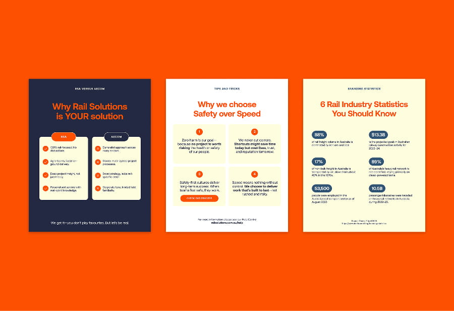
Some posters on a orange background with red letters.

Use accents with intention

Sometimes, our palette simply isn’t a broad enough range. So in those instances, reach for our brand accents to add contrast and diversity. Just be sure that our accent colors don’t overpower our core brand palette.

Some posters on a orange background with red letters.

Use accents with intention

Sometimes, our palette simply isn’t a broad enough range. So in those instances, reach for our brand accents to add contrast and diversity. Just be sure that our accent colors don’t overpower our core brand palette.

Some posters on a orange background with red letters.

Support

Need help with the guide?

We'll get back to you within 24h.

Support

Need help with the guide?

We'll get back to you within 24h.

Create a free website with Framer, the website builder loved by startups, designers and agencies.